
Social proof shouldn't stop at the product page
Most social proof tools put a message on the product page and call it done. But a shopper's journey runs through search, listings, recommendations, the cart and checkout, and evidence that appears at one stop and vanishes for the rest isn't a journey. Here's how Flockr completes it, quietly.
Picture where social proof usually lives on an e-commerce store. There's a message on the product page: "selling fast", "only 3 left". Perhaps the tool reaches the listing page too, and a few stretch to the cart. That's where most implementations stop.
But that isn't where shoppers stop. A real journey runs through search suggestions, listing pages that scroll forever, recommendation carousels, a recently-viewed strip, the cart drawer that slides in, and a checkout page where second thoughts happen. The product page is one stop on a much longer route, and a message that exists only there is evidence that appears once and then goes silent for the rest of the trip.
That silence has a cost. Social proof works because it answers a question the shopper is quietly asking at the moment of decision: is this a good choice? Shoppers make those decisions everywhere, not just on the product page. They shortlist from a listing page. They compare inside a search dropdown. They hesitate at checkout. If the evidence isn't present at those moments, it wasn't present when it mattered.

The journey is eight surfaces
Flockr renders messages on eight storefront surfaces: product pages, listing and category pages, search results, predictive search, recommendation carousels, the cart drawer, the cart page, and checkout. In practice that includes the modern shapes those surfaces take: listing pages with infinite scroll, recently-viewed carousels, the recommendation units inside a cart drawer.
Two of those are worth dwelling on, because they're where most tools give up. Messages render inside predictive search, the dropdown that appears as a shopper types, in a short form sized for the space. And they render inside recommendation carousels, including the ones powered by third-party discovery platforms: this is proven in production with Fast Simon at Steve Madden, where Flockr messages appear inside Fast Simon-powered search, predictive search and recommendations across the storefront.
Most tools stop at the product page. Some reach the listing page or the cart. We have not found another that completes the journey, from the first keystroke in the search box to the final look at checkout. And completing it matters more than it might sound, because the surfaces aren't interchangeable: each one catches the shopper in a different state of mind, and each is a decision point the others can't cover.
Different moments want different evidence
Eight surfaces could easily mean the same badge stamped eight times. It doesn't, and the reason is the part of the system that makes coverage engineering rather than spraying: every surface has its own eligibility rules, and the same product will say different things in different places. Sometimes it will say nothing at all.
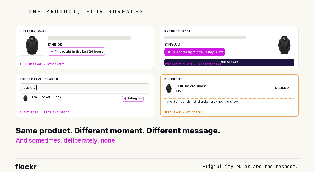
The journey has three broad moments, and the evidence shifts with them.
Discovery is where shoppers are scanning: listing pages, carousels, search, predictive search. Messages here help a product earn a click, so demand evidence does well: purchase counts, momentum, rank, staged newness. Space is tight, so messages shorten to fit; the listing page's "14 bought in the last 24 hours" becomes "Selling fast" in a predictive search row. Restock messages live here too, and only here, because "it's back" is useful to someone rediscovering a product and useless to someone who already has it in their bag.
Consideration is the product page: the most room, the most attention, and the place the strongest single claim belongs, up to and including the combined cart-pressure and scarcity message when both halves are genuinely true.
Commitment is the cart drawer, the cart, and checkout, and here the rules tighten deliberately. A shopper at checkout is deciding whether to finish, and only fresh, high-clarity evidence is allowed near that decision: purchase activity, real scarcity, ratings, live cart pressure. Softer signals, like browsing attention, are held back entirely. A "112 people viewed this" message might earn a click on a listing page; at checkout it's noise, so it never appears there.
One message runs the whole gamut: low stock. Genuine scarcity helps a shopper decide at every point in the journey, so it's the most broadly eligible message Flockr produces, welcome even in the strict moments where softer signals are held back.
The rules are the respect. A system that says the same thing everywhere isn't reading the room; a system that matches its evidence to the moment, and stays silent when nothing qualifies, is.
Quiet everywhere
Here's the objection the whole idea has to answer: doesn't eight surfaces of messages add up to a shouting store?
It would, if coverage meant volume. It doesn't. Every discipline Flockr applies to a single page applies on every surface independently: one message per slot, pages kept deliberately sparse, weak signals showing nothing. On a listing page of twenty-four products, a handful speak and the rest stay quiet. The same maths runs in the carousel, the search dropdown, the cart. Breadth multiplies the places evidence can appear; it doesn't multiply the amount of it. A store wallpapered in badges teaches shoppers to see none of them, and that lesson holds on every surface, so the restraint does too.
There's a compounding effect worth being honest about, because it cuts both ways. When a shopper meets your messages at eight points in a journey, trust accumulates fast, and so would damage. One fake or sloppy message anywhere would poison belief in every message everywhere. Ubiquity doesn't lower the bar for honesty; it raises it. That's why the coverage only works on top of everything else this blog keeps returning to: scarcity computed from live inventory, restocks that only fire on genuine arrivals, newness that expires itself. The breadth is safe because every individual message is true.
The message becomes part of the store
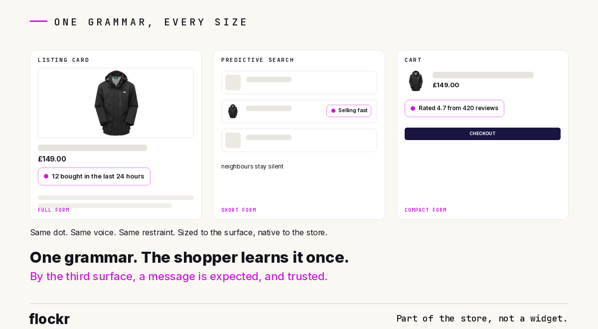
Something interesting happens when honest messages appear consistently across a whole journey, in one voice and one visual system: they stop reading as a third-party widget and start reading as part of the store.
The shopper learns the grammar without noticing they've learned it. A small mark with a short claim means something real is happening with this product: people are buying it, stock is genuinely tight, it's newly arrived and gaining attention. By the third surface, the message is a native feature of the storefront, subconsciously expected, the way price and product photography are expected. It carries the store's look and tone, so nothing about it feels bolted on.
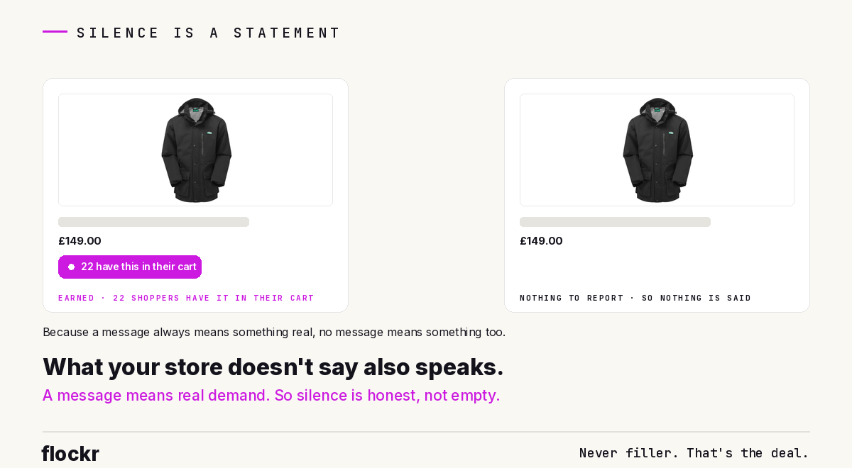
And once the grammar is learned, absence becomes information. If a message always means something real, then no message quietly says there's nothing remarkable to report, and that's honest too. This only works because Flockr never fills silence with filler; a system that padded quiet products with manufactured claims would destroy the very signal that makes the quiet meaningful. The store ends up with a vocabulary of exactly two registers, true evidence and honest silence, and shoppers can trust both.
The whole journey, quietly
Complete coverage and deliberate restraint sound like opposites. They're the same discipline seen from two angles: put evidence at every point where a decision happens, and at every one of those points, show only what's earned. Most tools do the reverse, one surface, saturated.
Evidence where decisions happen. Silence where nothing qualifies. One grammar, learned once, trusted everywhere. If you'd like to see what that looks like on your own storefront, the social proof messaging page walks through it, or book a walkthrough on a real store.